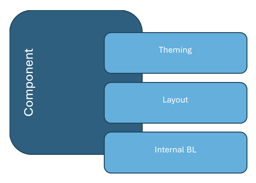
Component Breakdown
1. Theming (Look & Feel)
- Controls visual style (colors, fonts, spacing, animations).
- Must be cross-application adaptable (global theme tokens, theme provider).
- Should not affect behavior or logic.
- Examples:
- Button → size, color scheme, border-radius, hover effect.
- Notification → placement, background, animation style.
2. Layout (Structure & Composition)
- Defines how sub-parts are arranged, without changing the internal business rules.
- Should be overridable via builders/properties/configuration, not by rewriting component internals.
- Examples:
- Card → header, body.
- CMS Page → sidebar, content area, toolbar.
- Modal → header placement, close button position.
3. Internal Business Logic (BL)
- Encapsulates state management & functional behavior.
- Should be implicit by default (component manages its own state) but exposable for control.
- Must be type-safe → compile-time errors for missing logic.
- Examples:
- Dropdown → open/close state, keyboard navigation.
- File Picker → file validation, upload queue, error handling.
- Cache Manager → data persistence, eviction policies.
